The Chicago Red Stars are getting a makeover.
The National Women’s Soccer League club revealed a new name and crest Wednesday. Beginning in 2025, they will be known as the Chicago Stars Football Club as the franchise goes through its first major brand change since being founded in 2006.
The initial idea for potential changes arose following the ownership change when executive chairperson Laura Ricketts, who spearheaded an investment group, took over a year ago. There was a balance in developing a new team name and crest.
“There was always some discussion around whether or not it would make sense to evolve the logo and the name as meanings of signaling the evolution of the organization and where the vision was for it to go in the future,” chief marketing officer Kay Bradley told the Tribune.
“The intent and the thought behind the evolution is really to signal the next chapter for this club, while also ensuring that we are maintaining the elements of the previous design and previous name and also the elements of the club — from an organization and from a player and a team perspective and a ethos perspective — that were so critical to getting where the club is today, and building off of that as a as opposed to pivoting away from that.”
The concept came together in the spring and was finalized over the summer. The Red Stars name and current crest and kits will remain through this season, which features a return to the postseason under first-year head coach Lorne Donaldson after finishing last season 12th in the 14-team league. The organization felt the time was right to announce the changes.
“We’ve just started our journey, and we have a lot of hard work ahead of us,” Bradley said. “But we felt like it was a good inflection point with the ownership change, the leadership change, new players coming into the club, the success and performance on the field.
“We just felt like we had this upward momentum, and we want to keep it going.”
As they went through the rebranding process, the organization looked at “the breadth of all the clubs that exist” from a Chicago and NWSL perspective while also evaluating team branding from the design side. The club worked with agency Rabe X Birch to help design the new crest and Ona Creative during the launch process.
“We wanted to make sure that we felt like we fit as part of the NWSL ecosystem and also obviously create our own unique and differentiating look as well,” Bradley said. “Our goal was to create something that feels fresh, clean, modern and yet also timeless. We didn’t want something that felt really trendy and flashy for today, but then in a few years would feel obsolete.
“We want something that can stand the test of time and can help us build the future legacy of this club.”
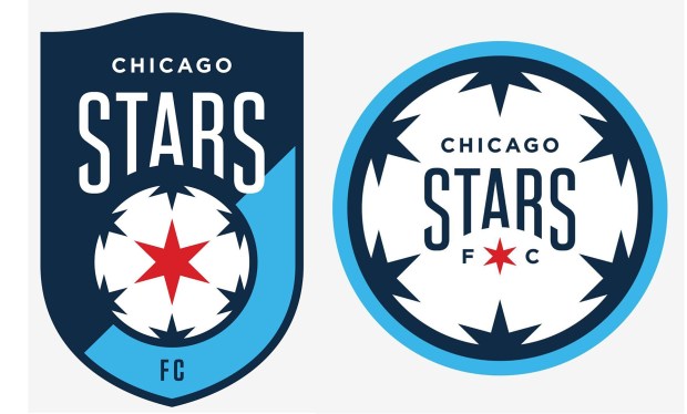
The Red Stars opted for a typical soccer crest shape and pulled some elements from their current crest. The new Stars FC crest retains the light blue, which keeps the connection to Chicago iconography and the city’s flag. The contrasting navy blue is supposed to represent Lake Michigan and the Chicago sky. A Chicago red star remains prominently front and center.
The decision to drop “Red” from the team name stems in part from wanting to ensure Chicago is more closely connected to their franchise and not a forgotten piece of their name. And by adding Football Club, there is no mistaking the sport.
“We are in a very exciting and crowded sports market and wanting to make sure that when people see our crest or they hear our name, that we’re telegraphing soccer,” Bradley said. “That’s why we’re here. That’s part of who we are.
“We feel like we’re re-upping our commitment to the city through this expression in our badge.”
Revamping the name and crest of a nearly 20-year-old franchise can be a challenging task. Staying connected to the fan base while also creating a community that welcomes new fans in the future isn’t always easy when redesigning a brand. But the fresh look creates a new era for an organization looking to move past the problematic previous ownership.
As the Red Stars went through the process and moved forward, they had conversations with players, staff and fans asking how they represent what the club means to them.
“All of which we used as ingredients and inspiration to ultimately inform where we are moving forward from a brand-look perspective and mark, and also a brand-positioning perspective,” Bradley said, “and then how we’ll act and behave and communicate as a brand moving forward.”