The post-industrial landscape that is Chicago Avenue immediately west of Pulaski Road on the West Side can seem physically daunting. Even the recent Public Safety Training Center comes off as a walled citadel that attempts, with limited success, to be a good neighbor.
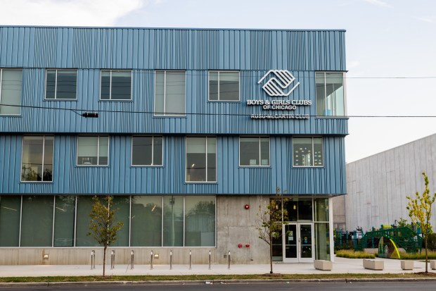
But just to the east of that vast building, the new Rusu-McCartin Boys & Girls Club (BCGC) shows how to create a tough building that engages the street and neighborhood in a thoughtful way. It’s tough in its materials — concrete and metal panels punctuated by large windows — that can endure the antics of its young users while maintaining a sense of playfulness and high art. Beyond just fulfilling its prescribed functions, principally after-school programs for boys and girls, it does what all good architecture does — it’s a place of heightened experience that can inspire awe and wonder.
The project’s architect is Latent Design, a Chicago firm founded by Katherine Darnstadt in 2010. Darnstadt is best known for Boombox — a series of distinctive prefabricated kiosks created throughout the city starting in 2016. Her competition-winning Austin United Affordable Housing (designed in collaboration with Valerio Dewalt Train) is currently under construction a short distance west of the BCGC project on Chicago Avenue.
Serving the Austin, West Humboldt Park and West Garfield Park neighborhoods, the new BCGC facility provides a wide variety of after-school activities for children ages 5 to 18. The first floor has a lobby welcome center, a games room, recording studio, teaching kitchen, cafeteria and gymnasium. The second floor houses an art room, makerspace, technology lab and ideas gallery. The third floor has an academic center, teen center, learning center and roof deck that overlooks a green roof atop the gymnasium.
Circulation throughout the building is embraced as an opportunity for architectural expression. The floors are color-coded to facilitate wayfinding while being downright fun (blue for the first floor, purple for the second and green for the third). Stressing healthy physical activity, the kids are encouraged to use the stairs for getting between floors, and the designers have made sure that these utilitarian spaces have a strong sense of place. Skylights flood the stairwells with natural light, and orange-painted railings are distinctive and happy. Once a visitor is on a floor, each room is accessed from a single corridor that has ample interior windows so staff can see what’s going on and kids can spy what others are doing.
On the exterior, the three-story building steps out toward Chicago Avenue as it rises with the second floor 2 feet wider than the first and the third floor larger than the second by a similar dimension. The cantilever is reminiscent of Marcel Breuer’s iconic Whitney Museum’s Breuer Building on Madison Avenue in New York and creates a bit of drama while increasing the size of the upper floors to better accommodate more programmed space within the facility.
While the building presents itself as predominantly metal and glass, its underlying structure is concrete. The double height gymnasium that occupies the entire south side of the building required long spans that are usually constructed of steel joists. But pandemic-related supply chain issues encountered during the design and early construction of the building suggested post-tensioned concrete as a more economical, albeit unorthodox, substitute. The use of concrete extends throughout the interiors as flooring in every space that’s not the gym. The building’s service core, which includes the stairs, elevator and restrooms, has exposed concrete floors, walls and ceilings.
The adjacent Public Safety Training Center breaks down its 280-foot-long façade along Chicago Avenue in order to create a more domestic scale. Latent does the opposite with the BCGS, allowing its full 120-foot-long face to extend without interruption to grant the building a civic scale that elevates its users. At the east and west sides of the building, the corrugated skin that encloses the building steps down toward the rear. This simple move, coupled with the outward stepping of the front facade, enlivens the overall massing with a distinctive profile.
One of the most dramatic features of the building is its reaction to changing light conditions. This involves a subtle sleight of hand by the architects. The color of each vertically corrugated metal panel is identical, but a broad range of variations is created by differing perforations in the panels. The appearance of the metallic blue finish changes color throughout the day depending on the light, whether it’s direct or indirect sun, cloudy or partly cloudy.
Easy to overlook because of its immense neighbor, the Rusu-McCartin Boys & Girls Club is a thoughtful essay on the place of modest buildings within the city’s landscape. It demonstrates that modest doesn’t need to be dull nor uninteresting. Its materials are simple and common, but deployed in sophisticated ways by a talented architect who bears watching.
The new Rusu-McCartin Boys & Girls Club is a quintessential Chicago building for the 21st century — straightforward, easily understandable and unmistakably tough. It’s even more important since it introduces kids on the West Side to good architecture at an early age.
Edward Keegan is an architect who practices, writes, broadcasts and teaches on architectural subjects. Keegan’s biweekly architecture column is supported by a grant from former Tribune critic Blair Kamin, as administered by the not-for-profit Journalism Funding Partners. The Tribune maintains editorial control over assignments and content.
Submit a letter, of no more than 400 words, to the editor here or email letters@chicagotribune.com.


