La Grange Park village trustees voted unanimously Tuesday to approve a rebranding concept developed by Span, a Chicago-based design studio
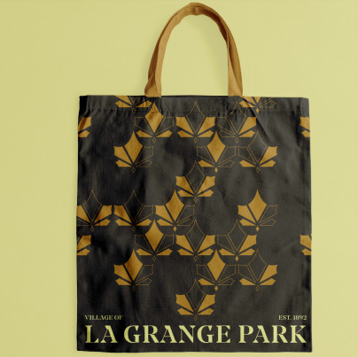
John Pobojewski, Span design director, said work with the Community Revitalization Committee settled on a maple leaf theme logo.
“It was really sort of inspired by the time of year we’re in right now,” Pobojewski said, displaying the gold maple leaf. “The logo, of course, has five leaves, inspired by the five families that founded La Grange Park.”
Pobojewski said the color theme was “inspired by the maple tree, the gold leaf color, the kind of lighter cream color, which we’re calling sunlight, and then bark, which is sort of a warm grey, kind of a brown, deep brown, for contrast.”
Also in the palette will be black, as shown on sample business cards displayed at the meeting.
Pobojewski said the maple leaf theme and the gold/cream color palette might be used on any number of areas, including village business cards and letterhead.
But with the idea behind the rebranding effort to establish a unique sense of place, emphasize community identity and create welcoming arrival points, there will be several other areas that will likely be modified in the rebranding.
New signs may be created for the front of public buildings, some street signs and on “way finding” signs indicating where places of interest might be, such as the public library Village Hall of the Village Market Shopping Center, Pobojewski said.
Other signs up for refurbishing would be public seating, village furnishings, decorative stop signs, receptacles, planters, bike racks and landscaping.
How many signs will be changed with the new logo will be part of the project being considered. With the concept approved, Span can begin work on specific proposals. The village contract with Span is for $81,400.
Although the rebranding might not be done at the same time as the streetscape improvement program, it is definitely part of the same effort.
“With your approval, we can start detailing that brand,” Pobojewski said. “When to use which version, how much space to use around it, what are the details of the color and typography.”
Trustee Robert Lautner said he liked the “fresh look and the approach, but I have to say, the more that I look at it, the gold palette just doesn’t hit me … it looks more like a fall theme, rather than a vibrant spring/summer theme.”
Trustee Karen Koncel agreed with Lautner.
“I associate vibrancy with more primary colors, rather than muted colors like this,” she said.
But their colleague Jamie Zaura was happy with the concept.
“I like everything,” she said, noting the black and gold on the business cards would stand out from regular black printing.
Lautner did agree that “the business cards look really sharp,” and both he and Koncel voted to approve the concept.
The next La Grange Park Village Board Meeting will be 7:30 p.m., Tuesday, Oct. 22 in the Village Hall Board room, 447 N. Catherine Ave.
Hank Beckman is a freelance reporter.


